Blogs

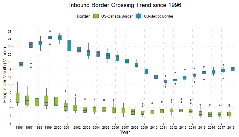
Boss of all plots - Box plots

I totally love boxplots, so much so that I may be even guilty of overusing it sometimes (if there is such a thing). Using just averages or percentile values is simplistic but they take away so much in terms of information. Histograms or Density plots work fine for showing individual distributions but may not work as well for comparisons. Boxplots are a great way to visualize and compare distributions across multiple groups or categories within the data in a concise way.

Continue reading

Creating Org Charts using igraph

In this post we will create some Organizational charts using the ‘igraph’ package in R. Network diagrams work great for representing team relationships or other connections amongst employees in an Org chart. An employee appears as a “node” or “vertice” of the network, while the relationships are represented by the “edges” or “links” that connect the nodes. We can also use the attributes such as color, shape and size to show team formations, specific roles or hierarchy.

Continue reading