

By Prakruti Shah | January 1, 2020
I totally love boxplots, so much so that I may be even guilty of overusing it sometimes (if there is such a thing). Using just averages or percentile values is simplistic but they take away so much in terms of information. Histograms or Density plots work fine for showing individual distributions but may not work as well for comparisons. Boxplots are a great way to visualize and compare distributions across multiple groups or categories within the data in a concise way. Though a little biased, this is why I think that boxplots are truly the boss of all plots!
In this post, we will not only learn to create boxplots (also called box and whisker plots) using ggplot2 but also understand it’s practical interpretation and application. Let us use an interesting dataset on inbound border crossing at the US-Mexico and US-Canadian ports of entry, collected by U.S. Customs and Border Protection (CBP). We can download this dataset from kaggle here.
Set-up
We will use ‘dplyr’ and’tidyr’ for data wrangling, ‘lubridate’ to work with dates, ‘kableExtra’ for beautiful tables, ‘DataExplorer’ to quickly learn about our data and lastly ‘ggplot2’ for making boxplots.
#install.packages("igraph")

##load library 'easypackages' to enable loading multiple libraries in the next step
library(easypackages)

##load all required libraries for the analysis
libraries("dplyr","tidyr","lubridate","ggplot2","knitr","kableExtra","DataExplorer")
Next, we will load the csv file that we downloaded from kaggle.
BorderEntryData <- read.csv("Border_Crossing_Entry_Data.csv")Data Preparation
“plot_missing()” is a handy function in the ‘DataExplorer’ package to quickly glance at the input data and check for any missing values. Fortunately for us, our dataset is complete and doesn’t need any imputation.
DataExplorer::plot_missing(BorderEntryData)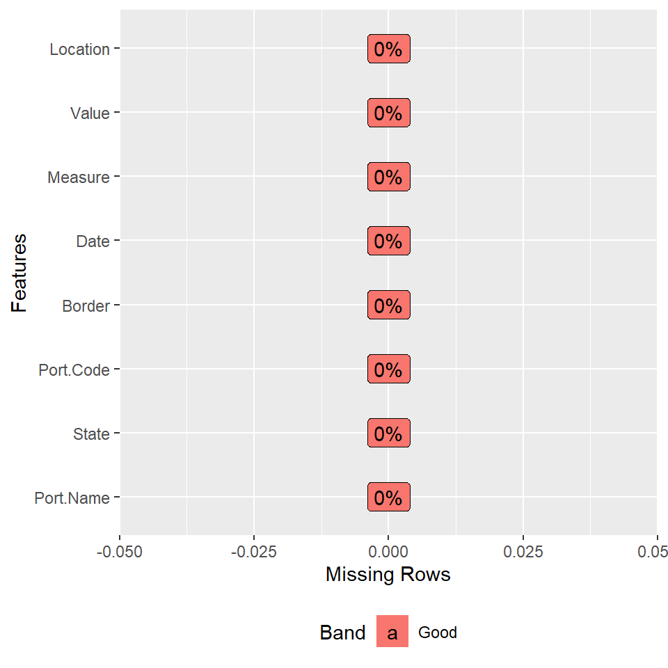
Now, let us look at the structure of the dataset to understand it a little better and also to see if we need to format any of the input variables before moving forward. Notice that the “Date” column is of class ‘factor’ and we would need to transform it into a ‘POSIXct’ class to enable any date manipulations.
str(BorderEntryData)## 'data.frame': 346733 obs. of 8 variables:
## $ Port.Name: Factor w/ 116 levels "Alcan","Alexandria Bay",..: 19 108 73 65 106 57 74 84 80 22 ...
## $ State : Factor w/ 15 levels "Alaska","Arizona",..: 3 5 3 2 10 5 11 13 11 10 ...
## $ Port.Code: int 2507 108 2506 2604 715 109 3401 2309 3403 712 ...
## $ Border : Factor w/ 2 levels "US-Canada Border",..: 2 1 2 2 1 1 1 2 1 1 ...
## $ Date : Factor w/ 279 levels "01/01/1996 12:00:00 AM",..: 72 72 72 72 72 72 72 72 72 72 ...
## $ Measure : Factor w/ 12 levels "Bus Passengers",..: 12 7 12 9 4 12 1 10 6 12 ...
## $ Value : int 34447 428 81217 62 16377 179 1054 1808 6685 24759 ...
## $ Location : Factor w/ 224 levels "POINT (-100.05 49)",..: 75 142 88 54 162 143 198 205 17 163 ...We can use the base function “as.POSIXct()” to transform the “Date” column into a calendar date format.
BorderEntryData$Date <- as.POSIXct(BorderEntryData$Date,format = "%m/%d/%Y")

str(BorderEntryData$Date)
## POSIXct[1:346733], format: "2019-03-01" "2019-03-01" "2019-03-01" "2019-03-01" "2019-03-01" ...The “Date” column defaults to the 1st day of the month and primarily stores only the year and month information. We will extract and store the “Year” and “Month” into their respective fields. This will give us much more flexibility during data manipulation and plotting.
BorderEntryData <- BorderEntryData %>% mutate(Year = year(Date),Month = month(Date))Now, let us look at what values are measured and stored in this dataset. Using a quick ‘dplyr’ operation we will count the data records by each individual measure.
BorderEntryData %>% group_by(Measure) %>% summarise(Count = n()) %>% kable(format = "html",caption = "Data records by Measure") %>% kable_styling(bootstrap_options = c("striped", "hover") , full_width = FALSE, position = "left") %>% scroll_box(height = "300px", width = "300px")| Measure | Count |
|---|---|
| Bus Passengers | 28820 |
| Buses | 28822 |
| Pedestrians | 28697 |
| Personal Vehicle Passengers | 30196 |
| Personal Vehicles | 30219 |
| Rail Containers Empty | 27684 |
| Rail Containers Full | 27657 |
| Train Passengers | 27623 |
| Trains | 27708 |
| Truck Containers Empty | 29757 |
| Truck Containers Full | 29694 |
| Trucks | 29856 |
We can pick the measures related to either vehicles or passengers in order to understand the inbound border crossing trends. Let’s say we are interested in the trends associated with the number of people that enter United States through either the Mexican or Canadian ports of entry.
First, we will subset the dataset to include information pertaining to passenger/pedestrian volume and then we will add up the volume per month irrespective of the mode of transportation used to cross the border. Notice that we are changing the class of the column “Measure” from ‘factor’ to ‘character’ so that we can apply the “grepl()” function for subsetting data.
BorderEntryPeople <- BorderEntryData %>%   #save subsetted input data into a new dataframe
  mutate(Measure = as.character(Measure)) %>%   #format as text string
  filter(grepl(pattern = "passenger|pedestrian",x = Measure,ignore.case = TRUE))   #pattern matching to subset data

##Count data records by measure to display the new dataframe
BorderEntryPeople %>% group_by(Measure) %>% summarise(Count = n()) %>% kable(format = "html",caption = "Data records by Measure") %>% kable_styling(bootstrap_options = c("striped", "hover") , full_width = FALSE, position = "left")| Measure | Count |
|---|---|
| Bus Passengers | 28820 |
| Pedestrians | 28697 |
| Personal Vehicle Passengers | 30196 |
| Train Passengers | 27623 |
##Compute total people crossing the border in any given month
BorderEntryPeople <- BorderEntryPeople %>% group_by(Border,Year,Month) %>% summarise(Count = sum(Value)/10^6)
We are almost done with our data preparation but before we start plotting, let us check the time frame of the data we have.
paste("Data ranges from",min(BorderEntryData$Date),"to",max(BorderEntryData$Date)) %>% kable(format = "html",col.names = "")| Data ranges from 1996-01-01 to 2019-03-01 |
We have complete data for all months starting from year 1996 except for 2019. We can keep or strip out the data for 2019, depending upon how we want to use the data. For example, if we were plotting monthly trends, we may want to keep all the data.
However, let’s say we are interested in looking at:
- Distribution of volume per month across each year.
- Compare overall trend across the two borders.
In this case, we will strip out the partial year to avoid skewing the overall trend. In place of subsetting the data, we will simply filter it out during plotting.
Boxplots
Now that our data is ready, we will start plotting. Here is a very basic boxplot added on to our filtered data.
boxplot <- BorderEntryPeople %>% filter(Year < 2019) %>%
 ggplot() +
 geom_boxplot(aes(x = as.factor(Year), y = Count, fill = Border), color = "#58585A")

boxplot
Next, we will add axis title, plot title, fill colors and various theme elements to our basic boxplot one by one. Here, we are showing both the US-Mexico and US-Canada trend on the same grid but we can easily apply the “facet_wrap()” or “facet_grid()” function to display them on separate axis.
boxplot +
 scale_x_discrete(name = "Year") +
 scale_y_continuous(breaks = seq(0,40,2),name = "People per Month (Million)") +
 scale_fill_manual(values = c("#90C432","#2494b5")) +
 ggtitle("Inbound Border Crossing Trend since 1996") +
 theme(panel.grid.major = element_line(colour = "gray", linetype = "dotted"),
      panel.grid.minor = element_line(linetype = "blank"),
      axis.title = element_text(size = 12,colour = "black"),
      axis.text = element_text(colour = "black",size = 8),
      plot.title = element_text(size = 15, colour = "black",  hjust = 0.5),
      panel.background = element_rect(fill = "white"),
      plot.background = element_rect(colour = NA),
      legend.position = "top", legend.direction = "horizontal")
Interpretation
First thing we notice is that the number of people entering United States through Mexico is way higher as compared to Canada. The overall volume has dropped from the 1990’s for both the borders. It has remained pretty consistent for Canada; however, the numbers have dropped rather drastically for Mexico until 2011 and now gradually adjusting and stabilizing over the recent period.
There was some monthly variation in the number of people entering the US from the Mexican and Canadian border until 2009 and 2001 respectively. After that, the inbound monthly traffic seems pretty consistent with the exception of 1-2 months represented by the outliers (dots). We can also notice a huge anomaly in 2001 with the monthly crossings varying drastically between 17-26 million at the US-Mexico border. A quick glance at the data reveals a sudden drop after September 2001 and hence the variation.
Does the drop in the number of people entering United States from Mexico after 2001 seem obvious to you? What else do you notice? Feel free to share your interpretation in the comments below.
Template by Bootstrapious. Ported to Hugo by DevCows.